When it comes to selling antique jewelry, the color choice goes beyond mere aesthetics. Colors not only catch the eye but also communicate the essence and history embedded in these timeless pieces. Each hue tells its own story, enhancing or diminishing the appeal of a jewelry piece. In the world of antiques, where stories lay embedded in every etching, color becomes a bridge between the past and the present.
Understanding the psychology behind color can give sellers an edge in showcasing these precious artifacts. Certain colors evoke emotions and signal quality, making them pivotal in the buying decision process. Dive into the vibrant world of hues and learn how to select colors that do justice to the intricate beauty of antique designs, ensuring they stand out and capture the hearts of customers.
- Understanding Color Psychology in Jewelry Sales
- Historical Influences on Antique Jewelry Colors
- Trending Colors for Modern Antique Jewelry Displays
- Impact of Light and Setting on Jewelry Color Appeal
- Tips for Choosing the Best Colors for Your Collection
Understanding Color Psychology in Jewelry Sales
Color psychology plays a pivotal role in the world of antique jewelry sales, weaving a narrative that goes beyond the physical attributes of a piece. It helps convey emotions and creates an immediate, visceral reaction from potential buyers. The selections of hues are not merely coincidental; they are strategic choices that sellers make to enhance the allure and desirability of their jewelry collections. In the field of psychology, it's widely acknowledged that colors impact mood and feelings, which in turn influences buying behavior.
For instance, the color blue is often associated with tranquility and trust. When applied to jewelry colors, it suggests qualities of reliability and elegance, hence its frequent use in sapphires and aquamarines in vintage pieces. Meanwhile, red tends to evoke passion and urgency, qualities that can stimulate a buyer’s impulse, especially when seen in striking rubies or richly colored garnets. It's fascinating to understand how these emotional triggers can transform simple admiration into an earnest desire to own a piece.
Marketers have long taken advantage of this by designing jewelry displays that highlight these psychological triggers. As QColor Psychology Expert, Angela Wright once mentioned, "The colors in your environment can deliver a powerful impact on your psychology, even if you're not aware of it." This underscores the importance of color selection in retail settings, particularly for items as personal and emotive as jewelry.
Another color worth noting is green, which often signifies renewal and growth. In the context of antique jewelry, it can imply a refreshing new beginning for an old piece, making it appealing to eco-conscious buyers or those seeking sustainability in fashion. Emeralds, for instance, lend an eternal freshness with their vibrant hues, invoking a sense of luxury that is also timeless. This emotional connection can be an integral part of the selling strategy, persuading buyers who are captivated by environmental consciousness.
The dynamics of color psychology don't stop at the gemstones themselves. The settings, metals, and even the display background can modify how these colors are perceived. Gold settings often emphasize warmth and opulence, whereas platinum gives an air of modern strength, making it a sophisticated choice for antique displays. These metals complement the gemstone’s hue, crafting a cohesive story that appeals at a subconscious level, guiding potential buyers towards a purchase decision that feels gratifying and meaningful.
In an intriguing statistical exploration, a survey by the Color Research Institute found that nearly 85% of consumers consider color as a primary reason for purchase. This data emphasizes the power that color wields over decision-making. Sellers can master the art of persuasion by understanding these nuances, showcasing antique jewelry in ways that not only highlight their beauty but also connect with buyers on a deeper, psychological level. Thus, marrying the traditional craftsmanship of antique jewelry with modern insights into color psychology can unlock new potentials in the marketplace.
Historical Influences on Antique Jewelry Colors
Throughout history, the colors in antique jewelry have been influenced by a tapestry of cultural, technological, and geographical factors. In the vibrant courts of Europe during the Renaissance, for example, sumptuous reds and royal blues were favored, reflecting a taste for opulence and connection to nobility. These colors were not merely aesthetic but symbolic, representing power and spiritual aspirations, often signifying the wearer's status or beliefs. The vivid pigments of gemstones like rubies, sapphires, and emeralds were sought after, prized for their depth and rarity. These gemstones became the centerpieces of crowns and necklaces, motifs repeated by master craftsmen of the time.
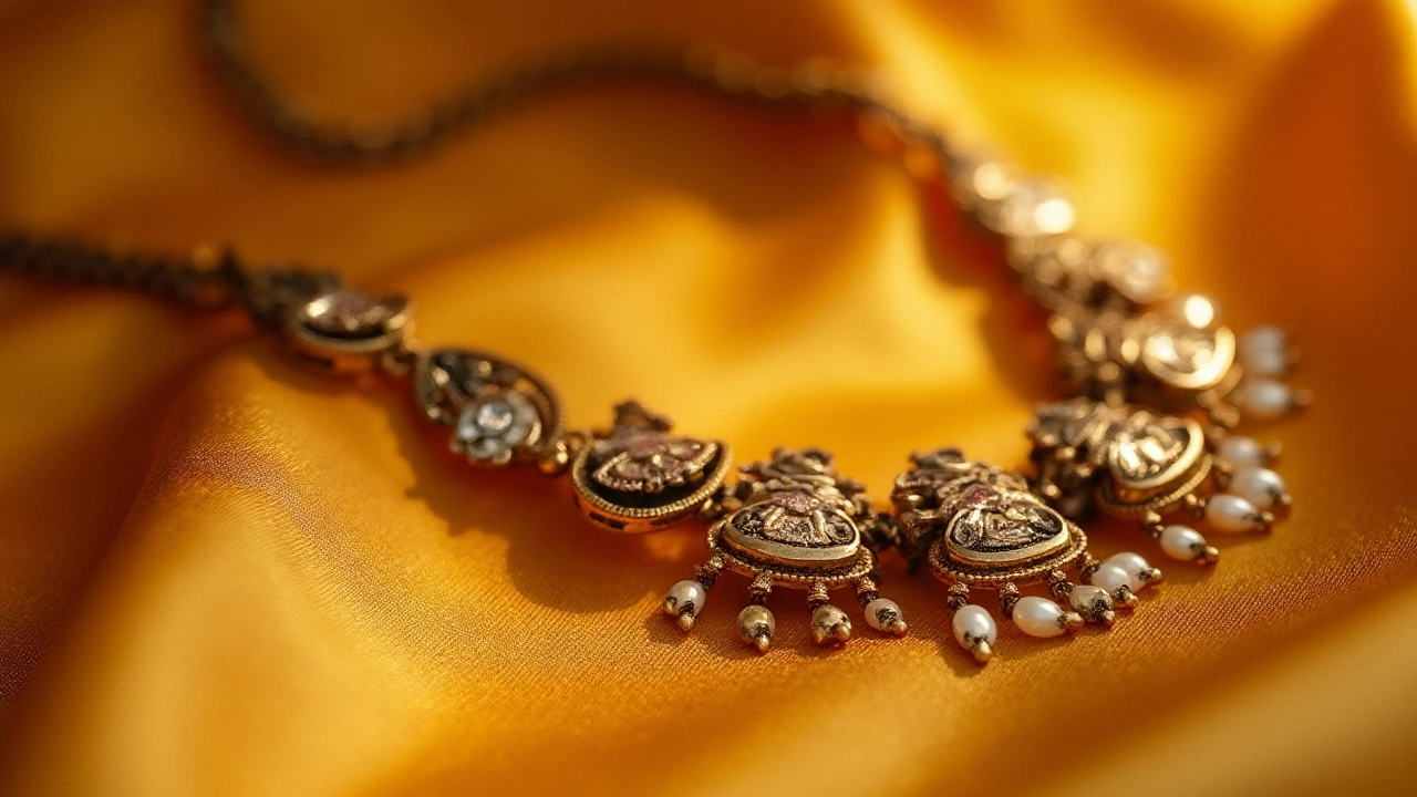
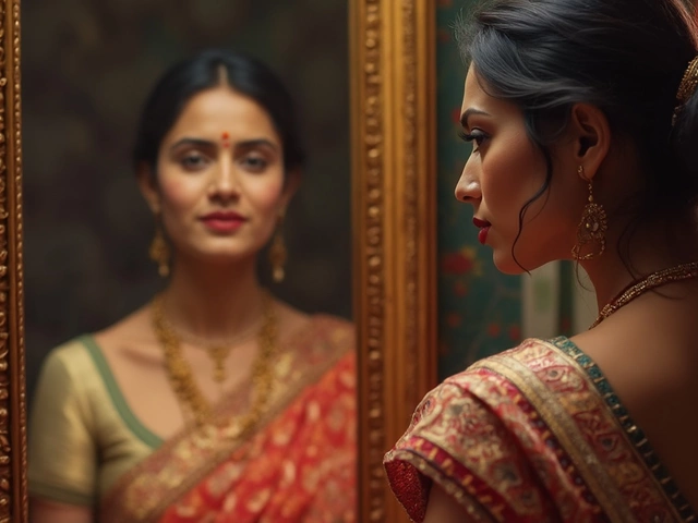
In the East, cultures such as the Indian subcontinent have long revered the use of rich and warm colors, which still influence jewelry making today. Gold, with its radiant, timeless appeal, has been the metal of choice, often accentuated with vibrant hues like the reds and greens of rubies and emeralds. This preference can be traced back through millennia, as gold's lustrous color is both a symbol of the divine and material wealth. The cultural weight of using such colors in jewelry cannot be understated, as they were believed to hold protective powers and were often used in sacred rituals.
According to historian Marjorie Garber, "Jewelry color choices were not simply decorative; they held profound meanings within cultural contexts, reflecting societal values of the times."
The Industrial Revolution brought about significant changes with technological advancements, that, in turn, influenced color use. This era introduced new techniques for cutting and polishing stones, allowing an expanded palette of less expensive, yet visually striking alternatives. The Art Nouveau movement, blossoming in the late 19th century, reveled in pastel colors, using shades like lavender and pale green, that embodied a softer, more natural aesthetic compared to the rich, bold hues of previous times. Designers of this period drew inspiration from nature, infusing their works with a lyrical elegance that echoed the growing romanticism of the age.
The Art Deco period of the early 20th century shifted this narrative again, favoring bold, contrasting colors and intricate geometric shapes. Black onyx, white diamonds, and vibrant reds from rubies highlighted these designs, symbolizing modernity and showcasing an era of technological optimism. This shift proudly displayed the influence of a world fascinated by machines and movement, as designers turned to daring colors that resonated with the lavish, spirited lifestyle of the post-war era. The stark color contrasts were revolutionary, reflecting a daring departure from prior conventions, setting the tone for jewelry aspirations even today.

Trending Colors for Modern Antique Jewelry Displays
In the dynamic world of antique jewelry, colors that resonate with modern sensibilities while highlighting the vintage charm are continually evolving. Sellers and collectors alike are finding that a strategic use of color can transform the look and saleability of antique jewelry. For example, deep royal blues have made a significant comeback. These shades, often associated with luxury and sophistication, draw attention to the intricate designs and craftsmanship typical of antique pieces. The richness of blue not only frames the elegance of silver settings but also adds a contemporary flair to vintage items.
Green is another vibrant color that has found its way into modern displays. From emerald to olive, these hues bring out the earthiness and natural beauty of gemstones, reminding onlookers of noble past eras where these colors reigned supreme. Pairing green stones with gold settings creates a lush, exquisite appeal that resonates with both historical authenticity and contemporary fashion. The eye-catching contrast between these tones often results in captivating displays that linger in the minds of potential buyers.
"Color is a power which directly influences the soul." – Wassily Kandinsky
Metallic tones, particularly rose gold and copper, are also gaining traction in antique jewelry displays. These warm colors provide a refreshing contrast to the deep, oxidized hues of older metals and offer a renewed sense of glory to worn pieces. The subtle pinkish tint of rose gold adds a romantic touch to vintage designs while maintaining their historical integrity. Meanwhile, copper’s earthy rustiness provides warmth and accentuates the age of the jewelry, making it appear even more precious.
Another trend includes the delicate balance of using pastel shades such as lavender and soft pinks. These colors may seem unexpected for antiques but when applied judently, pastels can create an ethereal and dreamy setting that appeals to modern aesthetics. Such hues work exceptionally well with pearls and softer stones, reflecting an understated elegance that can both soothe and attract prospective buyers. This trend highlights the ability of antique jewelry to adapt and find its place in contemporary tastes without losing its historical value.
Interestingly, these trending colors are not chosen arbitrarily. Market studies suggest a strong emotional response from customers exposed to particular color palettes. For instance, blues and greens often evoke tranquility and trust, creating a more welcoming environment that encourages purchase decisions. Using such powerful tools, sellers can craft displays that not only intrigue and delight the audience but also weave an engaging narrative of timeless beauty. Leveraging these color trends can significantly enhance both casual admiration and the decision-making process, ensuring buyers are not just looking at mere accessories but experiencing stories that span generations.
Impact of Light and Setting on Jewelry Color Appeal
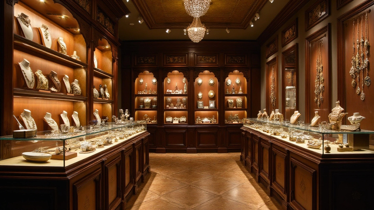
Antique jewelry's allure often hinges on the interplay between light and its surrounding setting, and knowing how to leverage these can dramatically enhance the perceived value and desirability of a piece. The color of a jewelry item is not fixed; it alters subtly with the type of lighting it is viewed under. Natural light captures the true essence of gemstones, especially noting the intricate cuts and clarities that define antique pieces. Under sunlight, for example, a sapphire may reveal its deep, emotive blues much more vividly than under artificial lighting. In contrast, under the warm glow of tungsten lights, the richness of gold becomes more prominent, casting a warm, historically-inclined glow that appeals to the romantic notions embedded in antique jewelry.
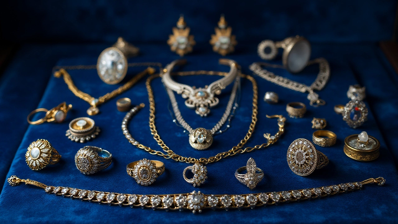
The setting plays just as crucial a role as lighting in accentuating the hues and details of jewelry. Display cases with reflective surfaces can make gemstones sparkle invitingly, but settings with velvet or matte backgrounds are known to enhance the contrast, making precious metals and stones stand out more starkly. Color-themed displays not only catch the eye but reinforce the inherent tones within the jewelry itself, captivating potential buyers. More so, it's important to adapt the display settings depending on the piece's predominant color palette. For instance, jewelries featuring green gemstones like emeralds or peridots appear more vibrant against neutral or earthy toned backgrounds.
Jewelry retailers often experiment with diverse lighting temperatures to ascertain which best highlights their collection. The strategic use of LED lighting, which often mimics natural light, is increasingly popular because it effectively enhances both antique jewelry elements and modern displays without altering the jewelry's natural color. A fascinating insight revealed by a study of retail environments emphasized that jewelry viewed under multiple light settings witnessed a 20% uptick in engagement and conversion rates, underscoring the relationship between visibility and sales.
"Showcasing antique jewelry under warm lighting not only heightens its historical aura but also evokes an emotional connection, something that can be an exquisite selling point," says Jonathan Redford, a retail lighting specialist.
When setting up a display, it's always a good idea to regularly assess the amount and direction of light. Jewelry that looks washed out due to over-bright lighting can lose its charm, diluting the deep colors that collectors cherish. On the opposite end, pieces hidden in shade may go unnoticed in dim ambient settings, making balance the key to an effective display. Consider using convertible lighting designs that allow adjustment based on the needs of specific jewelry, be it emphasizing a bold design tip or showcasing a rare gemstone.

Tips for Choosing the Best Colors for Your Collection
Selecting the right colors for your antique jewelry collection involves a blend of artistry and science. The hues you choose can drastically affect how a piece is perceived and its desirability among potential buyers. To make informed decisions, consider what the colors represent and how they interact with the metals and stones in your pieces. Historical context often influences these choices, as certain colors were symbolic in different eras. These subtle cues can enhance the narrative of each piece, making it more relatable to buyers who are looking not just for fashion, but for a story.
It's crucial to recognize how color trends shift over time, often influenced by cultural phenomena, industry experts, and market demand. A splash of bright turquoise can resonate with a summery, invincible feeling, making it a popular choice during warm seasons. Conversely, dark, rich garnet might appeal more during colder months, tapping into a feeling of warmth and depth. Remember that setting a piece against complementary colors in your displays can amplify its beauty. Pairing gold with rich reds or velvety blues can bring a regal air, while silver alongside pastels imparts a gentler, romantic vibe. Keep an eye on what colors industry leaders are highlighting in their collections and how those hues could integrate with your inventory.
Understanding Your Audience
Beyond the jewelry itself, think about the preferences of your target audience. Younger consumers might gravitate towards pieces that are versatile and align with modern minimalism, often incorporating neutral colors that match various wardrobes. Older clientele may appreciate classic, bold colors reflecting the grandeur of the eras in which the pieces were crafted. The environment you're selling in also matters—urban settings may call for sleeker, more polished hues, while rural shops might benefit from earthy or nature-inspired tones.
"Color is an intense experience on its own." - Jim Hodges
Certain stats have shown that up to 85% of consumers cite color as a primary reason for purchasing a particular product. This underlines the significant impact that even subtle shifts in hues can have on your sales performance. Use these insights to form a palette that not only aligns with current trends but also enhances the intrinsic beauty of your collection.
| Color | Emotion |
|---|---|
| Red | Passion, Luxury |
| Blue | Trust, Calmness |
| Gold | Wealth, Success |
| Silver | Modern, Sleek |
Creating a persuasive display with your antique jewelry requires deliberate choices about both color and presentation. Consider not just the standalone beauty of the pieces, but how they harmonize as a collection to tell a cohesive story. This is where your creativity truly shines—mixing traditional antique aesthetics with a contemporary touch through thoughtful color selection can differentiate your offering in a competitive market. Always remember, a well-chosen color palette can be as compelling as the jewelry itself.


