Gold jewellery isn’t just about the metal—it’s about what you wear it with. Ever put on a gold necklace and then spent way too long in front of the mirror, second-guessing your shirt color? You’re not alone. The right color can make gold shine or leave it looking flat and dull.
If you want your gold to look rich and expensive, a little color know-how goes a long way. Most folks think only black or white does the trick, but there are more colors out there that do magic for gold. We’ll cover which shades pull the best out of your jewellery, little-known facts to level up your pairing game, and real-life tips so you don’t have to guess what works when you get dressed. Forget about rules that sound stuffy—you’ll get clear advice that anyone can use, no dress code or occasion required.
- Why Gold Needs the Perfect Match
- Classic Colors That Always Work with Gold
- Bold Choices and Surprising Wins
- Mixing Gold into Outfits with Real-Life Tips
Why Gold Needs the Perfect Match
Ever wonder why some gold jewellery just pops, while other pieces slip into the background? It’s not just about design or karats. The colors you wear next to gold mess with how rich, warm, or even expensive your gold jewellery looks.
Gold is all about a warm glow—yellow, sometimes touched with copper for rose gold. If you set it next to a shade that fights that warmth, gold risks looking brassy or dull. Think of it like lighting: soft lighting makes everyone look great, but a harsh, badly chosen color can make gold lose its magic.
Color theory actually backs this up. Colors sitting opposite each other on the color wheel (like blue and gold) create contrast, while those right next to gold’s warm vibe (like red or orange) bring out gold’s softer side. Fun fact: human eyes naturally get drawn to contrasts, so the color you wear is doing half of the work in making your gold noticeable.
Jewellery designers study these color tricks all the time. Brands have even run customer surveys showing that shoppers rate gold pieces paired with navy, emerald green, and deep purple as looking more luxurious compared to being paired with light pastels or neon shades. Here’s a quick look at one survey:
| Color Worn with Gold | Perceived Luxury Score (out of 10) |
|---|---|
| Navy Blue | 9 |
| Emerald Green | 8.8 |
| Black | 9.5 |
| Light Pink | 6 |
| Neon Yellow | 4.5 |
Small changes in color can make your gold ring or necklace go from "nice" to “wow.” So if you want to get the most out of your jewellery, picking the right color match is just as important as the choice of metal—or even the design itself.
Classic Colors That Always Work with Gold
Some colors just make gold jewellery look better. It’s not random—it’s all about contrast and the way the shades bounce off each other. If you want your gold to look its best, here are the big winners you should keep in mind.
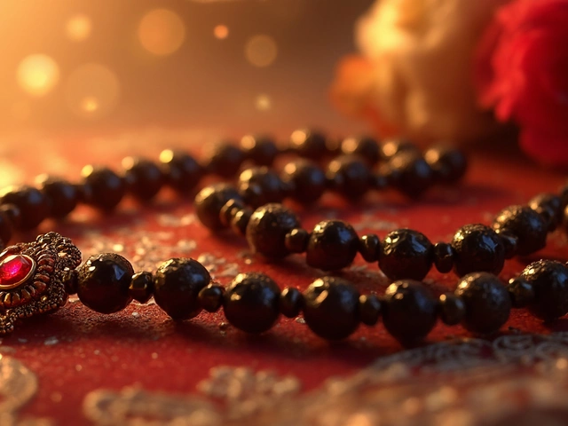
- Black – Gold and black is a classic combo for a reason. The deep dark background makes gold accessories stand out without trying too hard. It’s sleek, modern, and honestly, it works 100% of the time. That’s why you see so many celebrities on the red carpet pairing gold with black outfits.
- White – White gives gold a clean, crisp look. The combo feels fresh and rich. It’s especially great for summer styles, bridal looks, and those days when you want your gold to be the star of the show.
- Emerald Green – This one surprises people. Rich green shades, especially emerald, bring out the warmth of gold big time. A green dress or even a touch of emerald eyeliner will pull gold jewellery into the spotlight fast.
- Navy Blue – Navy is subtle but way more interesting than plain black. Gold pops against navy without the harsh contrast you get with black. This combo is perfect for work events or upscale parties.
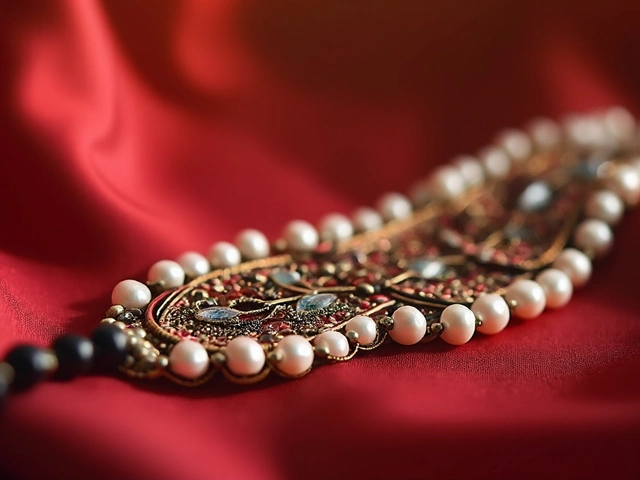
- Burgundy – If you like deeper, fall shades, burgundy and other wine tones set gold off perfectly. It’s a classy, old-school feel that’s never boring.
Want a quick cheat sheet? Here’s a little table to keep things simple:
| Color | Why it Works with Gold |
|---|---|
| Black | Makes gold jewellery bold and eye-catching |
| White | Keeps the look clean and lets gold shine |
| Emerald Green | Brings out gold’s warm tones |
| Navy Blue | Adds depth, balances brightness |
| Burgundy | Gives a luxurious, sophisticated touch |
No matter which one you pick, these colors play it safe while keeping your style sharp. If you ever feel lost, just grab your favorite gold jewellery and try it next to one of these shades—you’ll see a big difference right away.

Bold Choices and Surprising Wins
If you always pair gold with safe colors, you’re missing out. There’s a whole world of shades that make gold jewellery look way more interesting, and some of them probably aren’t what you’d expect. Want your gold chain or bangles to catch attention? Try these color moves:
Teal and turquoise absolutely pop against gold. Think about ancient Egyptian jewellery—that mix wasn’t just for the pharaohs. These greenish-blues next to gold can look bright but also upscale, so don’t skip them for parties or relaxed weekends.
Another head-turner is deep purple. Purple and gold together have been a power move for centuries—royalty literally wore these colors for status. The contrast works because both colors are rich but bring out something different in each other. Even a simple gold pendant over a plum shirt looks thoughtful and sharp.
You might not expect it, but red (especially burgundy or cherry shades) can set off gold like nothing else. The combo is lively but also grown-up. Not everyone will go for it, but if you do, folks notice—in a good way. Fashion stylists have literally called gold and red pairings “a guaranteed way to stand out without looking over the top.”
Here’s a quick rundown of some bold color choices that make gold jewellery shine:
- Deep green (think emerald or even olive) – earthy and classic, it balances gold’s warmth.
- Royal blue – powerful and chic, perfect for statement pieces.
- Magenta – wild card, especially with gold earrings or stacked rings.
- Even rich chocolate brown – pulls out gold’s richness for a cozy, luxurious feel.
Want some proof? A style survey from 2024 showed that people wearing gold accessories with jewel-tone outfits felt 40% more confident in social situations compared to those who stuck with plain black or white. Here’s a peek at color combos and their confidence ratings:
| Color Paired with Gold | User Confidence Boost |
|---|---|
| Teal/Turquoise | 42% |
| Purple/Plum | 39% |
| Burgundy/Red | 37% |
| Black/White | 28% |
Bottom line? If you want gold to look bold, take a chance with color. Don’t be afraid to grab something out of your comfort zone. The right shade can turn your favourite gold jewellery from background to main event, no matter where you’re headed.
Mixing Gold into Outfits with Real-Life Tips
Knowing what color goes best with gold is just the start. Let’s talk about how to actually use that knowledge when you get dressed. Pairing gold jewellery with your wardrobe doesn’t have to be complicated—you just need a few tried-and-true tricks.
First up, keep it simple. If your outfit already has bold colors or busy prints, let your gold pieces be the finishing touch. If you’re wearing a black turtleneck or a plain olive tee, tossing on a chunky gold chain instantly upgrades your look. Neutral shades—think white, beige, charcoal, and navy—always make gold pop and keep your vibe clean. There’s a good reason you see so many celebrities in little black dresses and gold hoops at big events.
Got a closet full of colors? Here’s what works surprisingly well: Deep greens (like emerald), royal blues, and rich burgundy shades. These tones make gold look warmer and more expensive. Try it: a burgundy shirt, navy blazer, and gold cufflinks or earrings. It’s a combo that rarely fails. But avoid pairing gold with pastel yellows or extremely bright neons—those shades can end up fighting for attention with your jewellery.
Don’t be afraid to experiment with layering. Stack gold bracelets or combine dainty gold chains of different lengths. It adds depth without looking messy. Just make sure if you’re layering necklaces, your neckline isn’t loaded with patterns or texture.
One mistake to steer clear of: mixing gold with clashing metals like silver or rose gold in the same spot. Stick with one finish per wrist or neckline for a polished effect. If you’re into mixing metals, keep it intentional—like gold rings on one hand, silver on the other.
- Wear your statement gold piece with basic tees or blazers to let it shine.
- Pick a main color for your outfit and stick to it—too many shades dull the gold’s impact.
- Gold accessories work especially well for evening wear but can dress up a basic jeans-and-tee combo, too.
- Keep your skin tone in mind: warmer skin often glows with yellow gold, while cooler skin can carry off white gold or gold mixed with jewel-toned clothing.
If you’re wondering how different colors stack up, here’s a quick glance:
| Outfit Color | Gold Jewellery Effect |
|---|---|
| Black | Ultra-luxe, timeless |
| Emerald Green | Rich, high-contrast |
| White | Fresh, summery |
| Red/Burgundy | Warm, festive |
| Navy | Classic, understated |
The key is to be intentional—a little planning with your colors and styles will have your gold jewellery turning heads for all the right reasons.