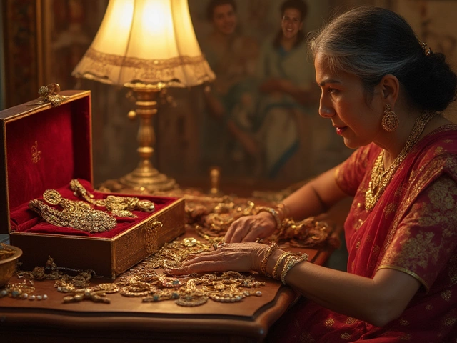
Gold jewelry is timeless and elegant, no question about it. But when it comes to pairing it with clothing, not all colors sing the same sweet harmony. You might be thinking, “Isn’t gold versatile?” And yes, it generally is—until you run into some color clashes that can steal its shine.
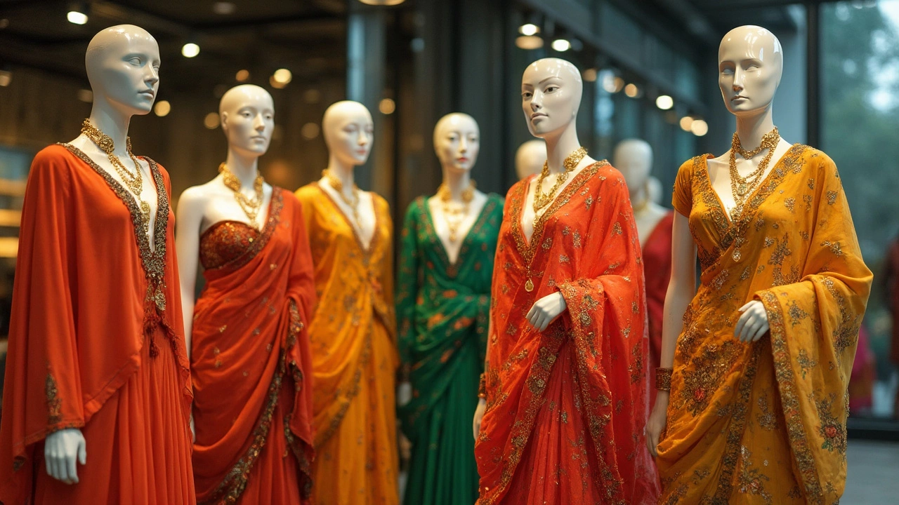
So, what two colors should have you treading carefully? Well, first up, bright oranges. They can compete too much with the natural warmth of gold. Imagine a rebellious teenager trying to outshine their older sibling—awkward, right? The result could be a visual mess rather than an outfit masterpiece.
The next color that often causes more harm than good is certain shades of green, especially the lime variety. They inadvertently pull focus from the jewelry. Gold tends to look its best when it’s the star, not just a supporting act.
Hop on the style train with us as we explore how to let your gold pieces truly sparkle by choosing complementary colors, and avoiding those that clash.
- The Basics of Gold Jewelry
- Colors That Complement Gold
- Colors to Avoid
- Fashion Faux Pas Explained
- Tips for Perfect Pairing
- Styling Gold with Confidence
The Basics of Gold Jewelry
Gold jewelry has been around for ages, and it's beloved for its luster and classic appeal. Whether you're into chunky chains or delicate pendants, knowing the basics helps you appreciate your pieces even more. First things first, gold isn't pure when it's used in jewelry. Pure gold, or 24k, is too soft for daily wear.
Most jewelry is made from gold mixed with metals like nickel, silver, or palladium to strengthen it. This is where karats come in—basically the gold's quality stamp. For instance, 18k gold is about 75% pure gold, while 14k is about 58%. The lower the karat, the harder and more durable it tends to be, which might be ideal if you're choosing something with everyday wear and tear.
Types of Gold Jewelry
- Yellow Gold: The classic look, usually mixed with copper and zinc. It's what you get when you think 'gold.' This type remains a timeless choice.
- White Gold: This has a silvery look and is typically coated with rhodium to enhance its shine. It's perfect if you're into a more modern, chic vibe.
- Rose Gold: Infused with copper, rose gold has a pinkish tint. It's romantic and trendy, often seen as more unique.
Care Tips
Proper care for your gold jewelry ensures it stays dazzling. Clean your pieces regularly with mild soap and water, and dry them with a soft cloth. Also, remember to store them in separate compartments to avoid scratches from other jewelry.
Keeping these simple tips in mind can significantly extend the life of your jewelry, helping you maintain its beauty for years to come.
Colors That Complement Gold
Pairing colors with gold jewelry can be a game-changer, taking any outfit from 'meh' to 'whoa!' But what’s the secret? It’s all in choosing tones that let gold shine as the star of the show.
Neutral Tones
Neutrals like black, white, and gray are go-to options. They provide a sleek background, allowing gold to pop. Ever notice how a gold necklace stands out against a little black dress? That’s the magic of contrast, my friends.
Earthy Hues
The warm, earthy tones like camel, olive, and chocolate brown play nicely with gold’s warm palette. Picture gold earrings against an olive jacket—it’s like a match made in style heaven.
Deep Jewel Tones
Rich, deep colors like royal blue, burgundy, and emerald elegantly elevate gold jewelry. These jewel tones are sophisticated and highlight the luxury of gold without competing for attention.
When you’re rummaging through your closet, asking, “What will make my gold pieces pop today?” sticking to these colors is a solid start. Just remember, the key is balancing richness and letting your gold shine through.
Contrast vs. Complement
Sometimes it's about creating contrasts that grab attention, like pairing gold with crisp white, and other times it's about complementing and blending warm tones together. Whichever route you choose, harmony is the goal.
Experiments are part of finding what works for you. Mix and match, try new pairings, and let your inner fashionista set the rules.
Colors to Avoid
When it comes to rocking that stunning gold jewelry, certain color combinations can really cramp your style. Let’s chat about those hues that should be approached with caution. Trust me, this knowledge is like fashion insurance—it’s better safe than sorry.
Bright Oranges
First on the list is bright orange. These bold tones can overpower the rich warmth of gold. Instead of working together, they tend to clash, creating a battle for attention. Imagine trying to juggle on a tightrope—doable, maybe, but not advisable.
Neon Greens
Next up, we’ve got neon greens. Think lime or chartreuse. These shades can make your gold jewelry look a bit lost in translation. The vibrant greens reflect less light, making your gold pieces seem duller than they actually are. Not exactly what you’re going for, right?
The Earthy Dilemma
Earth tones, like some shades of brown and certain types of forest green, can also be tricky. These colors have a way of muddying the brilliance of gold, instead of highlighting its allure. Imagine plopping your grandma’s fancy silver in dishwater—kind of like that.
Glaring Reds
Last but not least, let’s talk about glaring reds. While deep red can sometimes work if balanced right, anything too bright or flashy in the red family tends to upstage gold pieces. Your jewelry is an accessory, not a sideshow, after all.
So what’s the takeaway here? It’s all about harmony in your wardrobe. By avoiding these color clashes, you’re setting the stage for your gold to shine like it’s meant to. If in doubt, test it out—no harm in giving an outfit a test run before the big reveal!
Fashion Faux Pas Explained
Ever wondered why sometimes an outfit seems off despite having all the right pieces? It's often the result of a fashion faux pas lurking in the shadows, waiting to sabotage your style game. Let's shed some light on what this means, especially when it comes to mixing it up with gold jewelry.
Understanding Color Contrasts
Colors have psychological effects, vibes, if you will. Contrast too much, and your outfit might look chaotic instead of chic. With gold, a warm-toned metal, some colors just can't coexist without a little drama. Let's take bright oranges, for instance. They can turn into that attention-seeking friend who gets in the way instead of complementing your bling. People might notice the clash first before the craftsmanship of your jewelry.
The Green Conundrum
Greens can be tricky, especially certain vivid shades. Picture lime green as the loud party guest who commands all the attention. It steals the limelight from your intricate gold pieces and could make them appear less radiant. A softer sage or deep emerald might work better, letting the gold do the talking.
Getting the Balance Right
Balance is the name of the game. Think of your outfit as an orchestra; every piece plays its part, but the gold should be the lead singer, the star of the show. Opt for colors that let gold appear as a cohesive element rather than allowing it to be drowned out or overpower everything else. Simple earth tones and neutrals often make better backup singers, enhancing rather than overshadowing.
When avoiding these fashion tips, you'll be well on your way to showcasing your gold jewelry in the best possible light.
Tips for Perfect Pairing
Pairing your gold jewelry with the right colors can make or break your look. You want each piece to pop without competing unnecessarily with your outfit. Here are some practical tips to ensure you always make the right choice.
Stick to Neutrals
When in doubt, go neutral. Colors like white, beige, and black provide a perfect backdrop for gold. These colors highlight the jewelry's elegance without overwhelming it.
Opt for Earth Tones
Using earthy hues like browns and olive greens can enhance the natural warmth of gold jewelry. These colors blend seamlessly, creating a unified and sophisticated look.
Mind the Patterns
Too many bold patterns can distract from your gold pieces. If you’re wearing prints, make sure they don’t overshadow your jewelry. Simple patterns or solid colors often work best.
Understand the Occasion
It’s crucial to align your outfit with the event you're attending. For formal occasions, subtle and classic colors tend to do well. For something more casual, you have a bit more flexibility to play around with colors.
Check Compatibility
Spend a minute or two under different lighting to see how the colors of your outfit and accessories interact. A color mismatch might be less noticeable in your bedroom but glaringly obvious in daylight.
- Soft Blues: A cool tone like soft blue lets gold shine brightly, adding contrast without clashing.
- Warm Grays: These provide a subtle base for gold to stand out without being overshadowed.
- Blush Pink: It’s feminine and soft, playing well with gold without being too bold.
By keeping these handy tips in mind, you can let your gold jewelry designs be front and center, helping you shine brightly wherever you go.
Styling Gold with Confidence
When it comes to rocking your gold jewelry, confidence is key. It’s not just about wearing gold; it’s about making gold work for you. One primary consideration when styling gold is balance—ensuring nothing overshadows its natural elegance.
Keep it Simple
You don’t need to layer on a pile of gold jewelry to make a statement. In fact, sometimes less is more. Choose one signature piece, like a bold necklace or a striking bracelet, to take center stage. Let that piece do the talking.
Pay Attention to Necklines
The right necklace length can make or break your outfit. Round necklines, for instance, pair well with short, chunky pieces, while V-necks look cozy with delicate chains that mirror the neckline shape. Keeping these little details in mind can greatly enhance your overall look.
Color Combos That Work
Always think about the colors you adorn alongside your gold jewelry. Neutral tones, such as whites, blacks, and nudes, are perfect companions since they allow the gold to truly pop. If you’re in the mood for color, opt for jewel tones like emerald green or deep burgundy which complement rather than compete with gold’s warm tones.
Layer with Taste
If you’re into the layered look, just make sure it doesn’t turn into a tangled mess around your neck. Varying lengths can add depth and dimension, but try keeping it subtle—maybe two to three different pieces max. It's all about creating that harmony.
Gold Jewelry Care Tips
Don’t forget, confidence also comes from knowing your gold is in top shape. Regular cleaning keeps your pieces gleaming and looking new. Give your jewelry a gentle polish with a soft cloth every now and then.
Following these tips helps you step out with boldness, knowing your gold jewelry doesn’t just blend in, but stands out stylishly and effortlessly.