Color Contrast in Indian Fashion & Jewelry
When talking about color contrast, the visual difference between two or more colors placed side by side, creating impact and balance. Also known as contrast of colors, it guides how designers and shoppers create eye‑catching looks. In the world of Indian jewelry, pieces that blend gold, silver, gemstones and imitation metals to reflect cultural motifs and everyday fashion styling, the practice of putting together clothing and accessories for a desired effect, color contrast is a core tool. Understanding it helps you pick a one‑gram gold necklace that pops against a bright saree or a subtle nose pin that blends with a muted outfit.
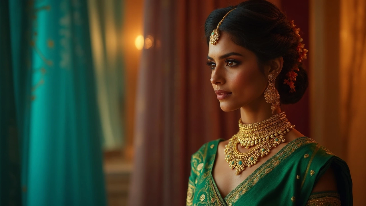
Traditional Attire and the Power of Contrast
Indian classics like sarees, lehengas and sherwanis rely on bold color pairings. A deep red silk paired with a gold border showcases a high color contrast that signals celebration, while a pastel lehenga with a soft ivory dupatta uses low contrast for elegance. The tradition of matching a mangalsutra’s gold hue with a bride’s red or maroon attire is a perfect example of contrast used to highlight significance. When you mix a bright turban with a muted kurta, the visual separation draws attention to the headpiece, making it the focal point of the ensemble. These choices are not random; they follow centuries‑old visual language that communicates status, mood and occasion.
Beyond clothing, traditional attire, heritage garments such as sarees, dhotis and salwar kameez that carry cultural meanings often incorporates contrasting trims, embroidery threads and border patterns. The contrast between a vibrant blouse and a subdued skirt can balance body proportions, while contrasting colors on a wedding rangoli echo the harmony sought in the ceremony. Knowing which colors naturally oppose each other—like blue and orange or green and pink—lets you design a look that feels intentional rather than chaotic.
Modern accessories have taken these age‑old principles and turned them on their heads. Imitation gold pieces from One Gram Gold Jewellery India, for example, can be paired with neon or pastel outfits to create striking juxtapositions. A one‑gram gold bangle worn with a teal blouse adds a metallic spark without overwhelming the look. Similarly, colored gemstone earrings—emerald, ruby or sapphire—can serve as a contrast point that lifts a monochrome saree. The key is to pick one element that stands out while keeping the rest cohesive, so the eye has a clear path to follow.
To master color contrast, start with a simple color wheel. Identify complementary colors (those opposite each other) for high impact, or analogous colors (those next to each other) for softer blends. Apply the rule of three: choose a dominant color, a secondary accent, and a highlight shade. In jewelry terms, the dominant color might be the metal’s hue, the secondary accent the gemstone’s tone, and the highlight a tiny enamel or bead detail. When shopping online, look for product images that show the piece against different backgrounds; this lets you gauge how the piece will behave in various contrast scenarios.
Now that you understand why color contrast matters across traditional outfits, modern fusion looks, and jewelry choices, you’re ready to explore real‑world examples. Below you’ll find articles that break down everything from app‑based dress shopping to the symbolism behind specific pieces, all tied together by the thread of contrast. Dive in and see how a little color awareness can upgrade your style game instantly.