Designing exquisite gold jewelry isn't just about craftsmanship; it's also about the colors that accompany it. Even the most skillfully crafted piece can miss the mark if the color palette doesn't harmonize well. It is vital to understand which color pairings, especially when combined with gold, can detract rather than enhance the piece's allure.
While some color combinations are timeless, others can inadvertently clash or lose the vibrancy that pure gold jewelry should exhibit. In this discussion, we will delve into three specific color pairings to steer clear of, ensuring your gold designs remain elegantly in vogue.
- Understanding the Impact of Colors on Jewelry
- Why Gold is a Unique Canvas
- The Bright and Bold: Yellow with Neon
- Muted and Muddy: Brown with Dull greens
- Cool Clashes: Silver with Bright Reds
- Tips for Picking Flattering Combinations
Understanding the Impact of Colors on Jewelry
Colors play a pivotal role in enhancing or diminishing the allure of gold jewelry. Each hue carries unique vibrations, emotions, and aesthetic values, which can dramatically transform the perception of the accessory. This understanding of colors goes beyond mere appearance; it's about invoking feelings and communicating style. The interplay between different colors can highlight or overshadow the natural warmth and luster of gold jewelry. With gold's rich and warm undertones, pairing it incorrectly can lead to a clash that detracts from the piece's elegance. A designer must comprehend how varying color combinations work to achieve a cohesive and harmonious design.
Historically, colors have been used to signal wealth, status, and personal tastes within jewelry. In certain cultures, particular color pairings hold meanings that enhance their symbolic power. Gold, with its perceived royalty and permanence, often becomes a focal point that needs careful pairing to maintain its timeless elegance. Working with gold jewelry, one learns that bright and bold colors can sometimes create a jarring visual scene if not balanced well. This balance is crucial as the supplementary colors must enhance, not overpower or muddle, the pure essence of gold.
For those delving into jewelry design, understanding color theory is essential. Colors are often grouped into three categories: warm, cool, and neutral. Gold naturally falls into the warm category, pairing favorably with analogous warm hues but conflicting with unexpected bright tones like neon. These principles of color theory dictate how colors contrast and complement each other. The color wheel serves as an invaluable tool in visualizing these relationships. By identifying the undertones present in different metals and gems, one can ensure symmetrical visual harmony, crucial for creating appealing and stylish gold jewelry pieces.
Studies have shown that color preferences in jewelry can vary widely between different demographics. For instance, younger consumers tend to lean towards bold and modern palettes, seeking uniqueness and personal expression through their accessories. While fashion trends influence these preferences, the timeless appeal remains with designs that exhibit a classical understanding of color interplay. A 2021 survey revealed that 58% of consumers preferred jewelry that exhibited balance in its color design. In the dynamic realm of fashion, some trends may fade quickly, but well-understood color principles retain their value and relevance.
An intuitive color combination encourages longevity in jewelry wear and popularity. It's not just about today's trends; it's about creating a piece that resonates for years to come. Successful designers are those who anticipate these shifts while maintaining the perennial elegance of the pieces they create. Matching colors in jewelry isn't only about aesthetics but also catering to personal stories and narratives that the wearer might want their accessory to tell—a resonance that lasts much longer than a seasonal fad.
The impact of a single hue on gold jewelry is fascinating, yet the true magnitude of its role unfolds when combined with other colors. Each blend requires careful consideration of historical context, current trends, and future possibilities. The artistry lies in combining these elements to create masterpieces that are not only visually stunning but also emotionally and culturally enlightening.
Why Gold is a Unique Canvas
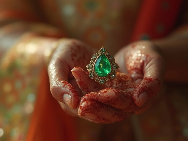
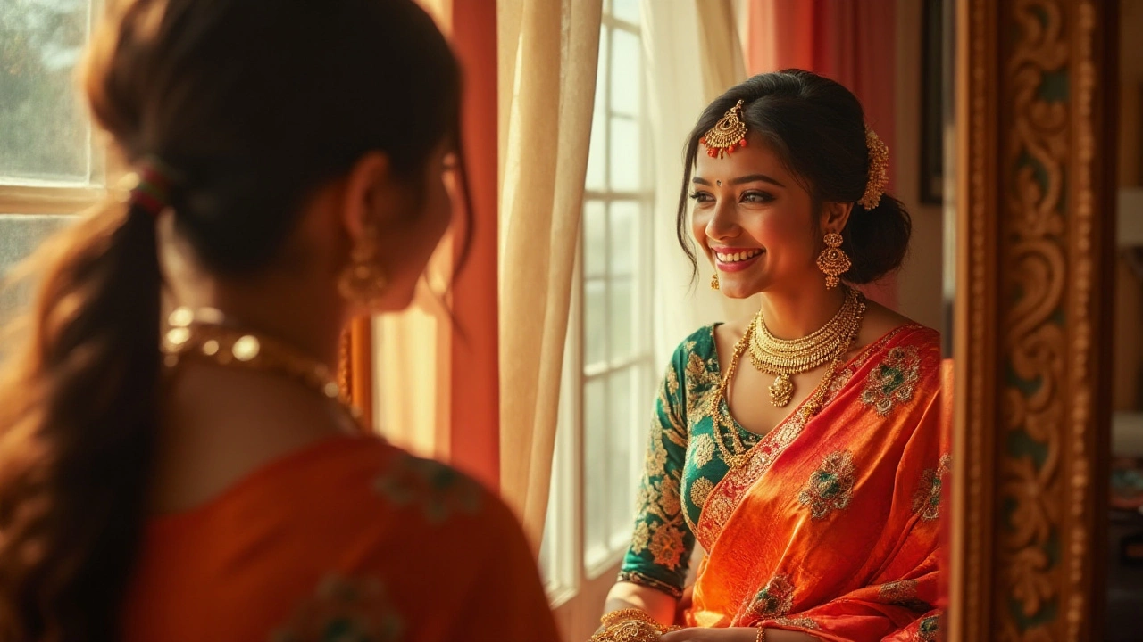
Gold has been a symbol of wealth, power, and elegance throughout history, making it a compelling choice for jewelry designs that aim to convey both luxury and timeless beauty. Unlike other metals, gold possesses a rich and warm hue that complements a vast array of skin tones, allowing it to act as a universally flattering backdrop. Its intrinsic value is not just in its physical properties; gold's malleability and corrosion resistance make it an incredible canvas for intricate designs that can endure generations.
One of the distinct advantages of using gold in jewelry is its ability to remain untarnished, maintaining its luster and surface integrity over time. This aspect makes it an excellent choice for pieces intended to last, such as heirlooms and those commemorating significant life events. Jewelry craftsmen often regard gold as the ideal medium due to its softness, which allows for detailed work. This makes it possible to craft fine designs that capture light in a way that is both captivating and subtle. Indeed, in the words of famed gemstone designer Cindy Chao, “Gold reflects and absorbs the light, making it both vibrant and steady.”
Cindy Chao: “Gold reflects and absorbs the light, making it both vibrant and steady.”
Color theory plays a significant role when we talk about gold's uniqueness as a canvas. Unlike metals such as silver, which can fade into the background, gold draws attention without overshadowing the gemstones or other design elements it might accompany. This balance is crucial; it ensures the entire piece speaks in harmony rather than presenting a disjointed appearance. The warmth of gold brings out the best in cooler gemstones, providing contrast that enhances the visual appeal of the piece.
In addition to its aesthetic virtues, gold's resilience to environmental factors sets it apart. It withstands humidity, saltwater, and other erosive elements, which is why ancient gold jewelry relics often remain in excellent condition after thousands of years. This enduring quality allows designers to create pieces that retain their beauty and structural integrity regardless of the conditions they might encounter. This particular trait of gold ensures that the designs revered today will remain equally appreciated by future generations who may wear them.
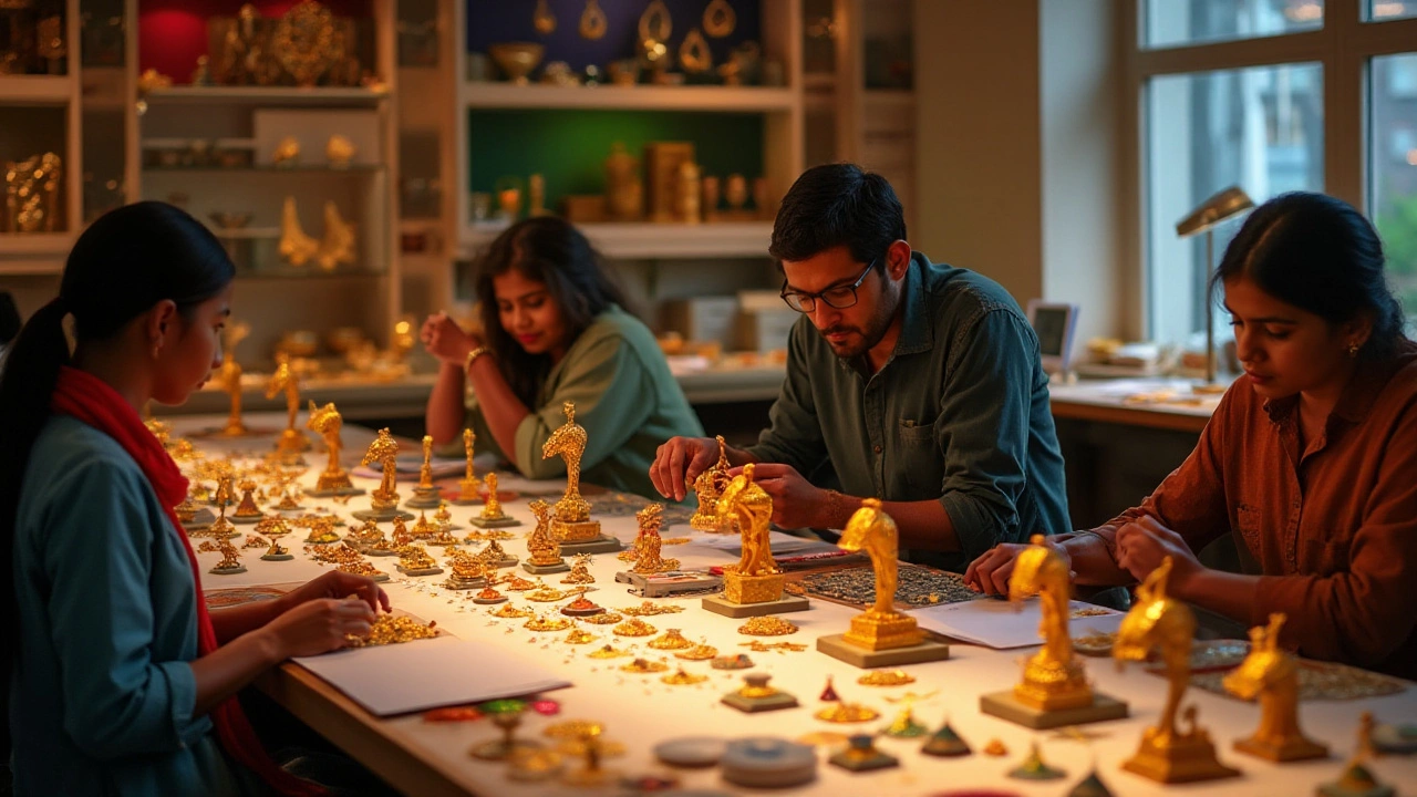
The versatility of gold also allows it to seamlessly integrate with various cultural and contemporary styles. It can be manipulated into polished, brushed, or even textured finishes, each bringing its own appeal and dimension to the jewelry piece. Designers often exploit this versatility to play with light and shadow or to create patterns that are distinctive and personal. With such a rich history and a broad palette of possibilities, gold indeed stands as a unique canvas that transcends time and fashion, keeping its status as a cherished material throughout the centuries.
The Bright and Bold: Yellow with Neon
When designing gold jewelry, color plays as crucial a role as the design itself. The allure of gold is often in its warm and lustrous glow, a quality that deserves a complementary palette. However, when paired with stark colors like neon, things can take an unexpectedly loud turn. Neon shades, known for their dazzling brightness, can overshadow the natural elegance of gold rather than complement it. Matching gold with neon may sound trendy at first, as the high fashion scene often dabbles in bold contrasts, but what works on fabric runways doesn't always translate well to the timeless art of jewelry crafting.
The core issue with yellow and neon combinations is the overwhelming brightness both colors bring. Gold's naturally yellow hue leans towards being elegant and understated, whereas neon is precisely the opposite—electric and attention-grabbing. This conflict means each color vies for attention rather than working in cohesion. Aesthetic balance is key in jewelry, and this pairing neglects that balance by creating visual noise rather than harmony, turning an elegant design into a spectacle. For example, famous designer Anna Sheffield once remarked, "Jewelry should subtly whisper elegance, not shout."
An interesting consideration is the psychological impact of colors. Neons can be seen as playful and youthful, often associated with nightlife and dynamic settings. While this can serve a design that aims to be whimsical or youthful, it might not align with the intent behind most gold jewelry pieces, which typically strive for sophistication and timelessness. It's about the message your jewelry is trying to communicate, and using neon may end up delivering mixed signals.
For artisans and enthusiasts who can't resist experimenting with neon, it's crucial to find the right balance. Instead of pairing neon directly with gold, consider using it as an accent in less dominating pieces. Gold earrings can have neon studs, but with more subtle tones or limited spaces. Alternatively, you could opt for pieces where neon and gold do not directly compete, such as gold bangles with small neon details contrasting against white or black backdrops. This consideration allows both colors to shine without vying for attention.
Interestingly, data from a recent fashion trend report indicates that while neon accessories had a fleeting moment of popularity among younger audiences, they ranked lower in preference for wedding pieces or formal collections, where gold is more traditionally utilized. These statistics hint at a broader cultural understanding that neon's boldness may not always align with gold's classic appeal. For those looking to innovate yet stay sophisticated, considering these trends and consumer preferences can ensure designs are both captivating and commercially viable.
Muted and Muddy: Brown with Dull greens
Gold jewelry is often seen as the epitome of elegance and luxury, a canvas that naturally glows with sophistication. But when it comes to incorporating additional colors, the choices can make or break the visual appeal. One particular combination to avoid is the use of brown with dull greens. This pairing tends to yield a muted and muddy appearance, which can diminish the inherent luster and vibrancy of gold jewelry. The earthy tones clash against the warm brightness of the gold, creating a visual disconnect that many find unappealing.
Dull greens, which lack the refreshing vigor of more vibrant shades, can often seem lifeless when paired with brown. Brown, although a naturally grounding color, when not balanced with the right complementary hues, tends to absorb rather than reflect light. In the context of gold jewelry, these colors might evoke a sense of heaviness or somberness. This is particularly evident in intricate designs where detailed craftsmanship could be overshadowed by the flatness of these color tones.
"Choosing the right color palette in jewelry design is akin to selecting a fine wine to pair with a meal; the wrong choice can mar the entire experience," notes renowned jewelry designer Amelia Clarke.Categories often flourish or falter based on their color mixes, and this is no less true for those involved in jewelry crafting where color synergy plays a pivotal role. While earthy colors might seem a natural choice for blending with gold due to their warm undertones, they require careful introduction and harmonious balance to avoid appearing drab.
An alternative approach for designers looking to incorporate earthy palettes is to opt for richer, more saturated greens and browns. These shades provide more dynamic contrast against the gold, allowing each element in the piece to stand out without muting the other. Exciting color pairings involve experimenting with emerald greens or richer chestnut browns that boast deeper tones and cleaner edges, amplifying the radiant quality of the gold rather than overshadowing it. For those inquiring, why avoid putting dull versions into designs? Because it often leads audiences to perceive the piece as outdated or boring, despite any innovative craftsmanship.
Some designers suggest using these colors sparingly, perhaps only as accent, rather than the dominant tones, which can both maintain richness and add depth without influencing the entire visual aspect of the piece. These suggestions point towards a more strategic design process where color acts as a narrative tool, drawing on the lush history of gold jewelry to inspire admiration rather than indifference.
Cool Clashes: Silver with Bright Reds
The interplay of colors in jewelry design is a delicate balance, and few pairings prove as challenging as combining silver with bright reds. These two hues, while striking on their own, often fail to harmonize when paired together in the context of gold jewelry designs. The reason primarily lies in the natural undertones and reflective qualities that each color possesses. Silver, with its cool, metallic sheen, often exudes a subdued elegance that aligns seamlessly with softer, more muted tones. However, when matched with the fiery intensity of bright reds, the relationship can become jarring, overshadowing the intrinsic beauty that both colors possess.
Red, known for its vivacity and intensity, can overshadow the subtle elegance of silver. This dominance can create visual competition within the jewelry piece, making it difficult for observers to focus on the nuances of the design. In practices, designers often find that pieces featuring this combination can lack cohesion, as both colors vie for attention. It has been noted that the cool tone of silver tends to 'cool down' the warmth and energy that red inherently holds, creating a visual dissonance rather than complementing the gold base that is often more subtle and sophisticated.
Moreover, when considering jewelry to be worn with different outfits or under various lighting conditions, the clash becomes even more apparent. Under daylight or intense indoor lighting, silver and bright red often reflect light in contrasting ways, which can amplify their discordance. A notable designer mentioned in an updated Journal of Fashion & Aesthetics remarked,
"The key to achieving a harmonious look is understanding the inherent contrast between warm and cool tones and knowing that not all contrasts are created equal."This insight underscores the importance of thoughtful color selection when crafting jewelry meant to highlight, not overwhelm.
For those who are passionate about incorporating bright red elements into their designs, there are methods to do so without sacrificing harmony. One approach is to use reds with a hint of orangey undertones, which tend to meld more fluidly with silver's cooler tones. Alternatively, utilizing red as a smaller accent rather than a dominant feature can reduce visual conflict. By integrating red sparingly, perhaps as a single gemstone setting or a fine enamel inlay, the connection between silver and red can be softened, allowing each to enhance the richness of the gold jewelry design.
Aware of these dynamics, savvy designers often turn to careful planning and experimentation to ensure that their pieces convey elegance rather than discord. As you explore different avenues in your own creations, remember to rely on both practice and informed selections to sidestep the pitfalls of silver with bright red. Balancing statement pieces with classic design principles is a journey worth taking, providing opportunities for creativity while upholding standards of timeless beauty.
Tips for Picking Flattering Combinations
Choosing the right color combinations for gold jewelry designs can feel daunting, but armed with a few simple guidelines, anyone can create stunning pieces that truly shine. First and foremost, understanding the inherent warmth of gold is key. It naturally complements warmer hues like rich burgundy or deep navy, which can add an elegant contrast, emphasizing the metal's luster. To ensure your gold piece stands out in the best possible way, consider these tried-and-true tips for success.
Start by seeking colors that either complement or beautifully contrast with gold jewelry. Soft earth tones such as terracotta or blush can create a harmonious, natural look, while bolder colors like emerald green or royal purple offer a striking contrast that accentuates gold's intrinsic richness. It's essential to visualize how colors will appear when light hits them, as lighting can dramatically alter perception. Observing your designs in both natural and artificial light can provide insights that are crucial for selecting the perfect palette.
Additionally, think about your audience's preferences and the occasions for which the jewelry is intended. For everyday wear, subtle colors that compliment a variety of outfits are ideal, while statement pieces for formal events might invite more daring choices. Taking a cue from color theory, some designers suggest experimenting with analogous colors—those that sit next to each other on the color wheel—like gold with shades of orange and yellow.
"Color does not add a pleasant quality to design—it reinforces it," notes renowned architect Pierre Bonnard. This nugget of wisdom underlines the importance of choosing colors that support and elevate your design rather than compete with it.
An understanding of current trends can be beneficial. Keeping an eye on the fashion runways and season's palettes offers fresh inspiration and aligns your designs with contemporary preferences. Many designers also turn to nature for inspiration, appreciating how naturally occurring color combinations work harmoniously in the world around them. Gold, with its sunlit warmth, often pairs well with the greens and blues seen in natural settings.
For those inclined towards a structured approach, consider creating a color swatch palette. Such a tool is invaluable in comparing different looks and experimenting before committing to a final design. Additionally, incorporating texture can add depth to your color choices. Pairing gold with textured materials such as leather or polished stones can create dynamic interest and showcase a thoughtful approach.
Practical Steps for Testing Color Combinations
- Gather swatches of potential colors and materials.
- Layout your swatches next to the gold jewelry under varied lighting conditions.
- Take note of combinations that catch your eye and evoke the feelings you aim to capture.
- Be open to unexpected pairings; sometimes, the most unlikely combinations can surprise with their beauty.
Picking flattering color combinations isn't an exact science, but with a little experimentation and creativity, you can ensure your gold jewelry designs consistently shine. Don't be afraid to push boundaries and explore beyond conventional trends; every designer's intuition can foster innovation and beauty in the world of jewelry design.